Strategies to Enhance the "Add to Cart" Experience
The “Add to Cart” button is one of the most critical elements of an ecommerce website. It represents the transition from browsing to buying and serves as a key point in the customer journey. A seamless, engaging, and optimized “Add to Cart” experience can significantly boost conversion rates, reduce cart abandonment, and improve customer satisfaction. In this article, we explore effective strategies to enhance the “Add to Cart” experience, turning casual visitors into paying customers.
1. Optimize the “Add to Cart” Button Design
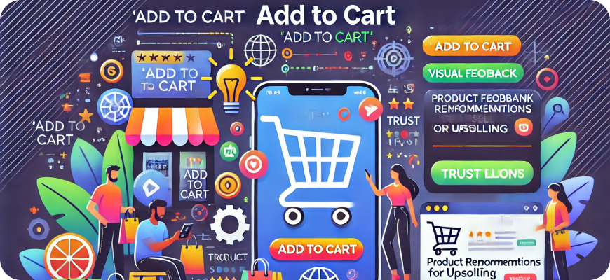
The design of your “Add to Cart” button can have a big impact on conversion rates. A visually appealing and strategically placed button encourages users to take action.
- Use a contrasting color: The button should stand out from the rest of the page. Use a color that contrasts with your site’s background and draws attention without being overly jarring.
- Make it large and legible: The “Add to Cart” button should be large enough to click easily, especially for mobile users. Ensure the text is readable and clear.
- Use clear and action-oriented text: Use straightforward and action-oriented labels like “Add to Cart” or “Buy Now.” Avoid vague terms such as “Submit” or “Next.”
- Consider microanimations: Adding subtle animations (e.g., a slight bounce or color change when hovered over) can draw attention to the button and make the experience more engaging.
2. Provide Visual and Functional Feedback
Giving users feedback after they click “Add to Cart” reassures them that their action has been successful. This feedback can take different forms:
- Confirmation popups: Display a small confirmation window or modal that shows the item has been added to the cart. Include options to “View Cart” or “Continue Shopping.”
- Cart animations: Use a smooth animation that moves the product image or an icon to the shopping cart area, visually indicating that the item has been added.
- Real-time cart updates: Ensure that the shopping cart icon or counter updates in real-time to reflect the newly added item.
3. Implement a Quick-Add Feature
The quick-add functionality allows customers to add items to their cart directly from product listing pages without visiting the product detail page. This can speed up the shopping process, especially for repeat buyers.
- Quick-add buttons on category pages: Display a small “Add to Cart” button below product thumbnails on listing pages, making it easy to add items with one click.
- Configurable product options: If you sell products with options (e.g., sizes, colors), allow customers to select these options in a dropdown menu or popup before adding to the cart.
4. Show Relevant Product Details and Variants
Before adding an item to the cart, ensure customers have all the necessary information to make a confident decision.
- Display key product details: Show important details such as price, size, color, availability, and any applicable promotions near the “Add to Cart” button.
- Stock availability alerts: If an item has limited stock, show a notice (e.g., “Only 3 left in stock!”) to encourage urgency.
- Provide a size guide: For clothing and footwear, offer size guides to help customers choose the right fit before adding an item to their cart.
5. Leverage Product Recommendations
Integrating product recommendations near the “Add to Cart” button can increase the average order value (AOV) and improve the overall shopping experience.
- Upsell and cross-sell suggestions: Show related or complementary products that customers may want to add to their order.
- “Customers Also Bought” sections: Highlight products that other customers frequently purchase together.
- Personalized recommendations: Use customer data and browsing behavior to show tailored suggestions.
6. Offer Easy Customization and Personalization Options
If you sell products that can be customized or personalized, make the process as easy and intuitive as possible.
- Interactive customization tools: Provide a user-friendly interface that allows customers to customize products (e.g., add text, choose colors) before adding them to their cart.
- Live previews: Show real-time previews of customized products to help customers visualize their choices.
7. Provide a Clear and Simple Cart Preview
A cart preview allows customers to quickly view and modify their cart without navigating away from the product page. This can reduce friction and encourage continued browsing.
- Mini-cart preview: Display a small cart summary that appears when a customer adds an item to their cart. Include key details like product name, quantity, and total price.
- Easy editing options: Allow customers to remove items, change quantities, or apply discounts directly from the cart preview.
8. Create a Sense of Urgency
Encouraging customers to act quickly by creating a sense of urgency can improve conversions.
- Time-limited offers: Display countdown timers for limited-time promotions or flash sales.
- Low-stock alerts: Let customers know when items are running low to create a fear of missing out (FOMO).
9. Ensure a Seamless Mobile Experience
A growing number of customers shop on mobile devices, making mobile optimization essential for a smooth “Add to Cart” experience.
- Responsive design: Ensure your website is fully responsive, adapting to different screen sizes and orientations.
- Touch-friendly buttons: Make sure the “Add to Cart” button is large enough for touch input and placed prominently on mobile screens.
- Minimize distractions: Remove unnecessary clutter on product pages to focus attention on key actions, such as adding items to the cart.
10. Offer Multiple Payment Options and Flexibility
Flexibility in payment options can remove barriers to purchase and increase conversion rates.
- Accept a variety of payment methods: Include options such as credit cards, digital wallets (e.g., PayPal, Apple Pay), and Buy Now, Pay Later (BNPL) services.
- Display payment options early: Show available payment options near the “Add to Cart” button to reassure customers that their preferred method is accepted.
11. Use Trust Signals and Security Features
Customers need to feel confident about their purchase before adding an item to their cart. Building trust is crucial.
- Trust badges and certifications: Display security badges (e.g., SSL certificates, trusted payment provider logos) near the “Add to Cart” button.
- Clear return and refund policies: Clearly state your return and refund policies on the product page.
- Customer reviews and ratings: Show customer reviews and ratings to build credibility and trust.
12. Provide Contextual Assistance
Shoppers may have questions or concerns before adding an item to their cart. Providing quick and helpful support can prevent hesitation.
- Live chat support: Offer live chat or chatbot assistance on product pages to answer questions in real-time.
- Tooltips and FAQs: Include tooltips or small popups with answers to common questions about the product.
13. Minimize Disruptions and Distractions
Once a customer clicks “Add to Cart,” you want to keep their attention focused on completing the purchase.
- Avoid unnecessary popups: Limit the use of popups or banners that may distract customers after they add an item to their cart.
- Streamline cross-selling efforts: If showing related products, do so in a way that doesn’t disrupt the shopping flow.
14. Enable Wishlist Functionality
Sometimes customers aren’t ready to make a purchase immediately. Providing a wishlist feature allows them to save items for later.
- Add to Wishlist option: Include a clear “Add to Wishlist” button alongside the “Add to Cart” button.
- Wishlist reminders: Send email reminders to customers about items in their wishlist, especially if they are on sale or low in stock.
15. Incorporate Real-Time Inventory Updates
Inventory availability can change quickly, especially during high-traffic periods. Keeping customers informed about stock levels in real-time can enhance their shopping experience.
- Real-time stock indicators: Show real-time inventory levels to manage expectations and encourage timely purchases.
- Backorder options: For out-of-stock items, provide a backorder option with an estimated shipping date.
16. Personalize the “Add to Cart” Experience
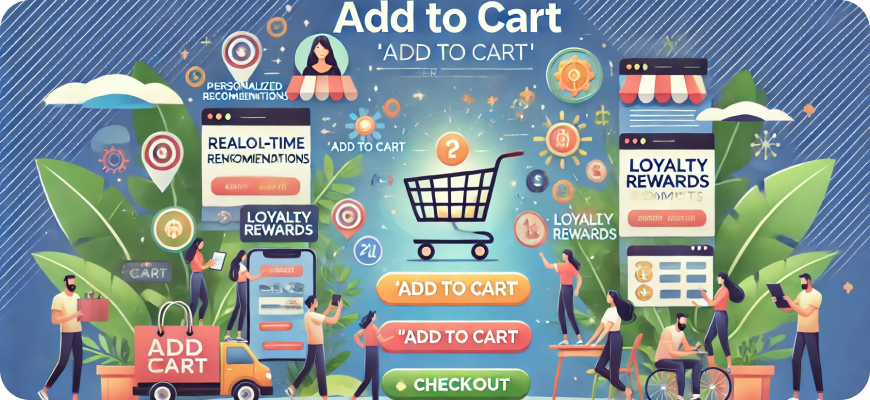
Tailoring the “Add to Cart” experience to individual customers based on their preferences and behaviors can drive more conversions.
- Dynamic content: Show personalized promotions or messages near the “Add to Cart” button based on customer history.
- Loyalty rewards prompts: If a customer is part of a loyalty program, display points they can earn or redeem for the item they’re adding to the cart.
17. Make “Add to Cart” Actions Easy to Reverse
Allowing customers to easily modify or undo their “Add to Cart” actions can improve their confidence and reduce friction.
- Easy removal options: Include a clear “Remove” or “Undo” button in the cart summary or mini-cart preview.
- Edit product options: Enable customers to modify product details (e.g., size, quantity) without having to remove and re-add the item.
18. A/B Test “Add to Cart” Elements
Continuous improvement is key to optimizing the “Add to Cart” experience. A/B testing allows you to make data-driven decisions.
- Test button text and color: Experiment with different wording, colors, and placement of the “Add to Cart” button.
- Compare feedback types: Try different forms of feedback (e.g., popups vs. animations) to see what resonates best with your audience.
- Measure conversions: Track conversion rates and other key metrics to identify which changes have the greatest impact.
Conclusion
Enhancing the “Add to Cart” experience in ecommerce requires a combination of thoughtful design, personalization, trust-building measures, and seamless functionality. By optimizing every touchpoint around this critical action, you can turn more browsers into buyers, increase conversion rates, and create a satisfying shopping experience for your customers. Whether through visual feedback, personalized recommendations, or mobile-friendly designs, each improvement brings you closer to a frictionless and delightful customer journey.

